.EDYou · Case Study

.EDYou

A community app designed for alternative school students ages 14–18 who miss out on the social experiences of traditional high school. Edyou bridges that gap with event discovery, creation, and peer connection — both online and in person. Community starts here.

Role
UX Designer & Researcher
Team
5 Members
Duration
2 Months
Tools
Figma, FigJam
1
Discovery
2
Design
3
Final Solution
4
Ethics
5
Outcomes

Click a phase to jump to that section

01 — Understanding the Problem

Discovery

The Problem

As more families transition to alternative schooling, a social gap has emerged. Students in homeschool, online school, and micro-school environments lack the community events, social connections, and shared experiences that traditional high school provides. They miss prom, club activities, sports, lunch tables — the informal moments that build lasting friendships and a sense of belonging.

Target Audience

My research focused on students ages 14–18 in alternative education. I conducted interviews with homeschooled students, online learners, and micro-school attendees. The pattern was clear: they felt isolated and disconnected from their peers. They wanted events, community, and a place to find people like them. This demographic was the group most affected by the social isolation gap.

Research Insight

When interviewing alternative school students, a recurring theme emerged: they lack community and fun events at their schools. Students feel they're missing out on the typical high school experience. One interviewee said, "I wish there was something like Instagram but for finding events with people my age." This insight directly inspired Edyou — a platform that puts event discovery and peer connection at the center.

02 — Designing the Solution

Design Evolution

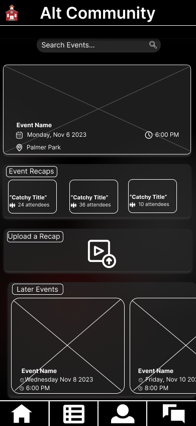
From Concept to Identity

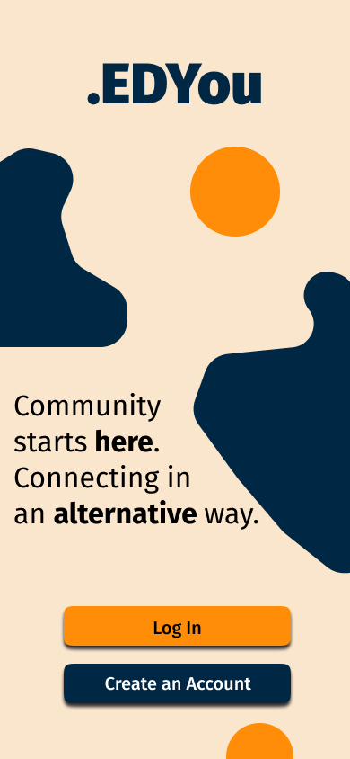
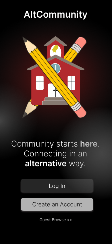
We started with paper sketches and lo-fi wireframes to explore user flows. The early concept was called "AltCommunity" — dark, utilitarian, uninviting. We tested it with students and the feedback was immediate: it felt like a homework platform, not a social community. We iterated through names and concepts: "Schoolhouse" was too generic. Finally, we landed on ".EDYou" — a modern pun on education that feels current and inviting. The name became the foundation for everything that followed.

Visual Identity

I chose orange and blue using color theory as my guide. Orange conveys warmth, approachability, and energy — qualities essential for a community app targeting teens. Blue grounds the design with trust and stability. Together, they create personality without distraction. The typography leverages a modern sans-serif for body text and a warm serif accent for headlines, creating hierarchy and sophistication.

My Contributions

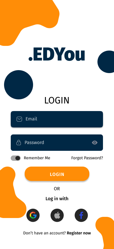
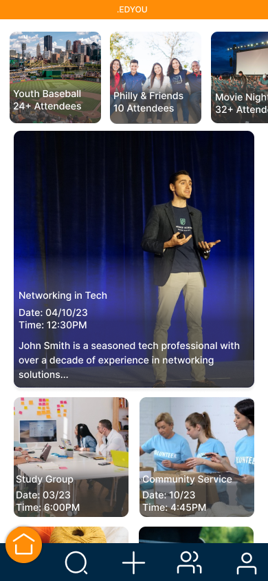
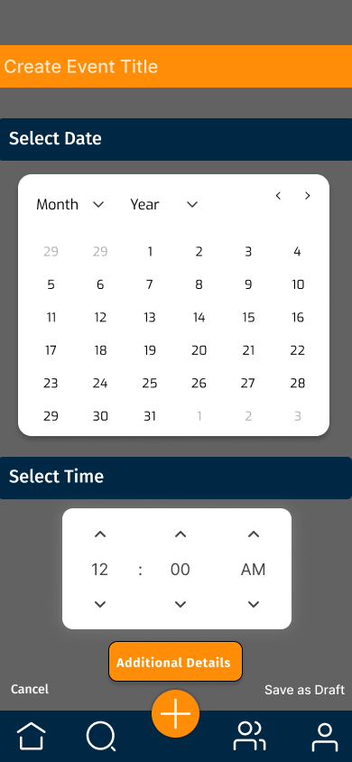
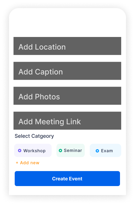
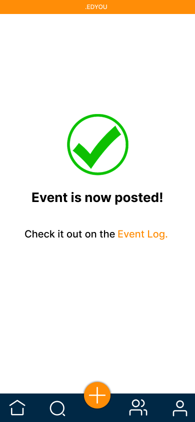
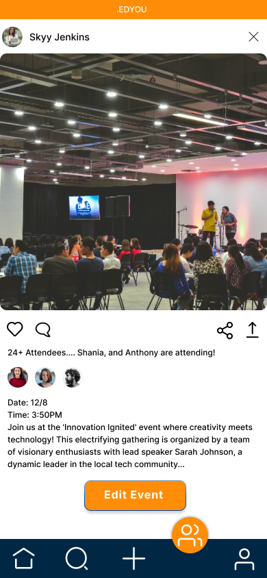
I designed the sign-in and registration flow to be frictionless, with social auth options for quick onboarding. I created the event creation flow — a guided experience where users can add photos, set dates/times, and add categories. And I designed the home feed, which surfaces events based on interest filtering and proximity. These three flows became the core of the product.

Lo-Fi to Hi-Fi Progression

Low Fidelity

Low-fi landing page

Low Fidelity

Low-fi home screen

User Flows & MoSCoW Prioritization

We mapped four main user flows: Login/Registration, Event Search & Discovery, Event Creation, and Profile Management. I used MoSCoW prioritization to guide the product scope:

Must Have

  • Event feed with trending/nearby discovery
  • Event creation with full details (date, time, location, category)
  • Frictionless login and registration
  • Interest-based filtering

Should Have

  • Discussion forum for events
  • Profile with RSVP history and event log
  • Gamified point system for engagement

Could Have

  • In-app direct messaging
  • Calendar integration

Won't (Yet)

  • Live streaming capability
  • Video chat features

03 — The Polished Product

Final Solution

After rounds of design refinement and feedback integration, here are the final high-fidelity screens. Each screen was crafted to be intuitive, engaging, and optimized for how teens actually use social platforms.

← Scroll to explore all screens →

04 — Responsibility Matters

Ethical Considerations

Designing for minors requires an ethical lens. Every feature decision carries weight. I approached this project with three core principles in mind.

Design Ethics

Building a safe, inclusive community.

Gamification

Point System Ethics

While gamification encourages engagement, there's a real risk of unhealthy competition or social pressure among teens. I designed the point system to promote collaboration and positive interactions — sharing events, helping others find community — not accumulation or social hierarchy.

Privacy

Data Protection

Critical given the target audience is minors. I gave careful consideration to how student data is collected, stored, and shared. Default privacy settings keep profiles semi-private, and location data is only used for event proximity — never sold or shared with third parties.

Community

Safe Spaces

The app must foster genuine community, not become another source of social pressure or exclusion. I incorporated reporting features, community guidelines visible in onboarding, and moderation tools to ensure events and interactions remain positive and inclusive.

05 — What I Learned

Outcomes & Key Takeaways

01

Design for the Underserved

Alternative school students are a real, overlooked user group. My research validated that the social gap is deeply felt. Designing for a specific, underserved demographic creates stronger solutions than designing for the "average" user.

02

Brand Identity Shapes First Impressions

The evolution from "AltCommunity" to ".EDYou" showed how naming and visual identity directly impact whether teens feel welcomed or left out. A good name is more than catchy — it's a promise of who the app is for.

03

Ethical Design is Non-Negotiable

Designing for minors means every feature needs an ethical lens. From point systems to data privacy to community safety, every decision affects trust and belonging. Cutting corners on ethics cuts corners on the product itself.

04

Micro-Interactions Create Delight

Small moments — like a heart icon interaction when joining an event — foster emotional connection between users and the platform. These moments are often overlooked but they're what makes an app feel alive rather than functional.

Next Project

Toyota: Tap. Hitch. Go!

A trailer hitching guide for Toyota drivers — combining mobile and in-vehicle experiences.