01 — Understanding the Problem
Discovery
User Problem Statement
"How can a trailer hitching application be designed to simplify the process for drivers, addressing frustrations and challenges while providing clear guidance?"
Business Problem Statement
"How can Toyota leverage the development of a trailer hitching application to enhance brand reputation, meet the demand for innovative automotive solutions, and improve customer satisfaction and competitiveness in the automotive market?"
The Challenge
Trailer hitching is often stressful and error-prone — especially for beginner drivers. Many users struggle with aligning the hitch, understanding safety protocols, or selecting the correct equipment size. Even experienced users expressed frustration with unclear feedback and inconsistent camera guidance.
Toyota challenged us to design a step-by-step trailer hitching experience, creating both infotainment screens and a mobile app interface that would guide users through the process with clarity, enhance safety, and build confidence for drivers of all experience levels.
Project Objectives
Integrate into Toyota App & Cars
Seamless experience across mobile companion app and in-vehicle infotainment systems.
Implement Car Spatial Technology
Leverage camera feeds and spatial awareness for real-time alignment guidance.
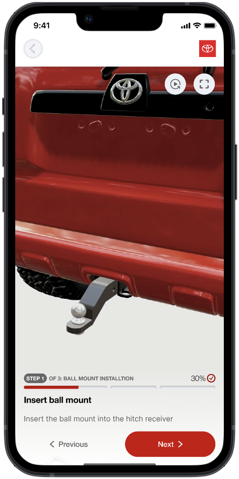
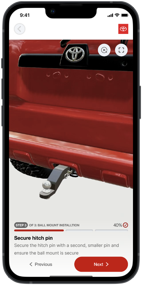
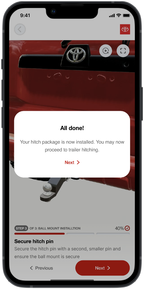
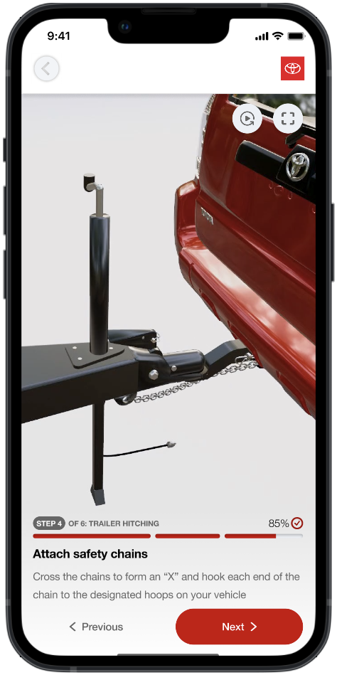
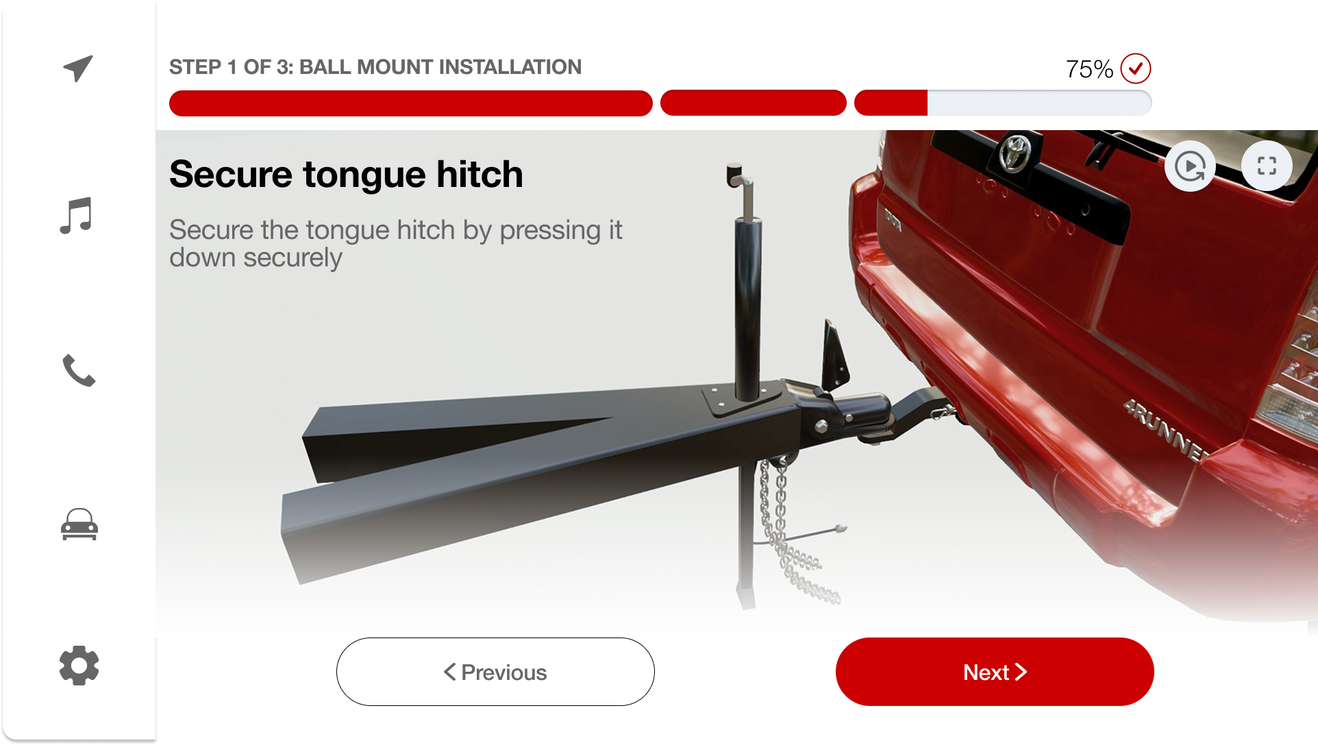
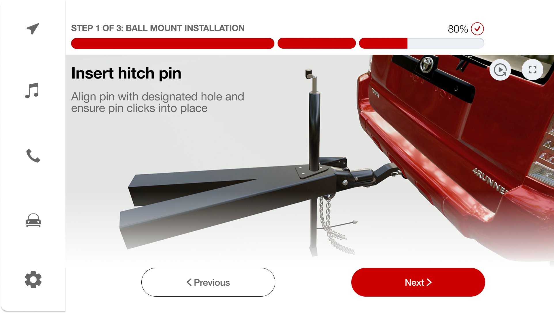
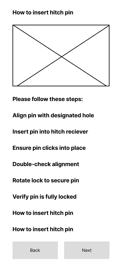
Step-by-Step Guidance System
Progressive walkthrough so users never feel lost during the hitching process.
Follow Global Safety Compliances
Adhere to established safety standards for towing, weight, and equipment protocols.
UX Requirements
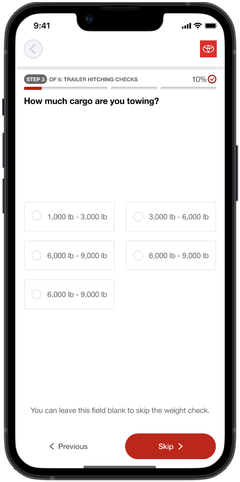
Check Weight Distribution
Ensure proper tongue weight and trailer load balance before departure.
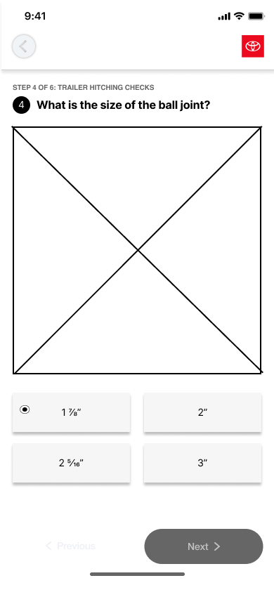
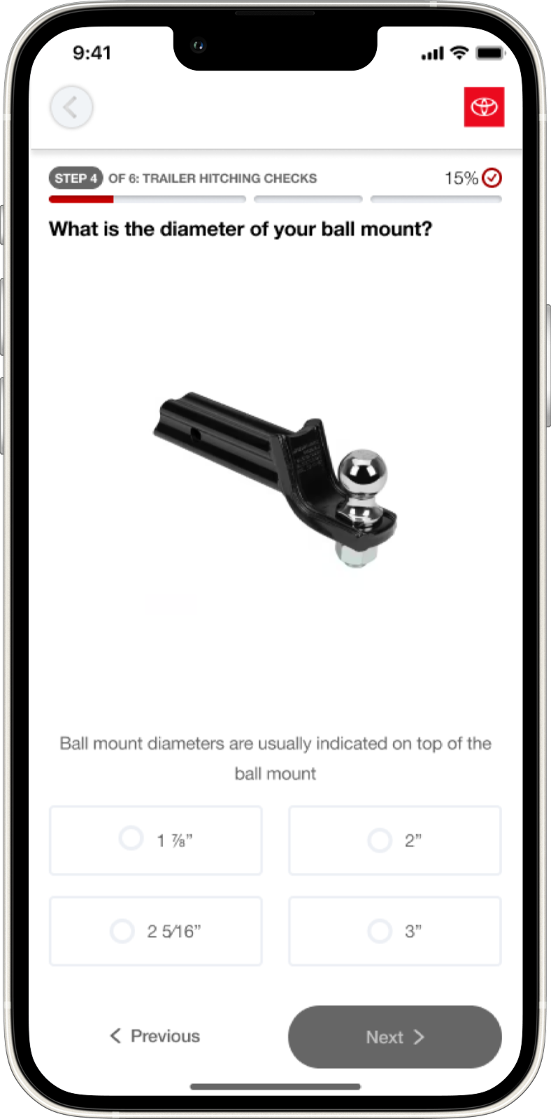
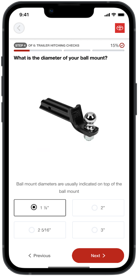
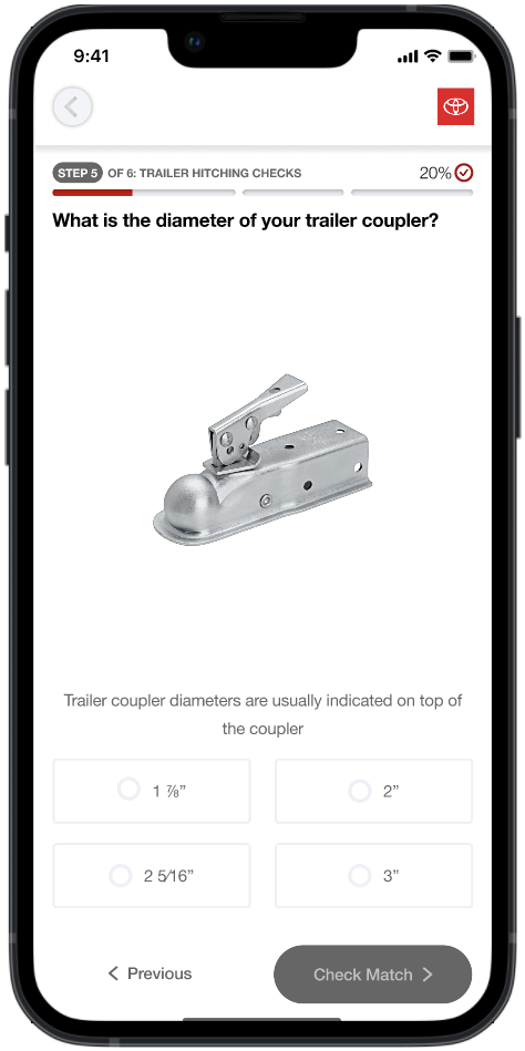
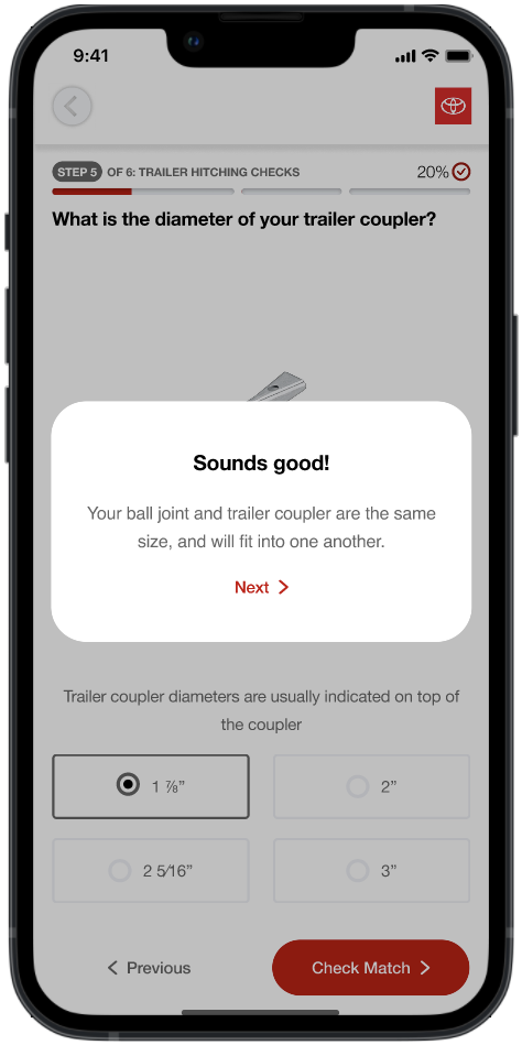
Flexible to Differing Hardware
Adapt to various hitch types, ball sizes, and coupler configurations.
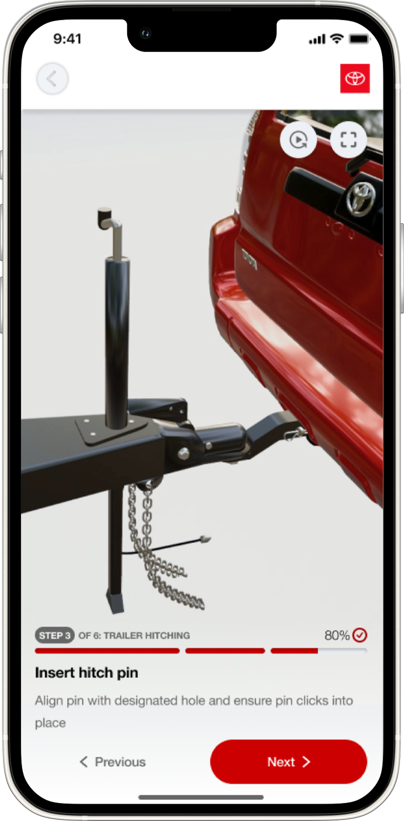
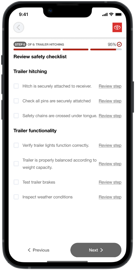
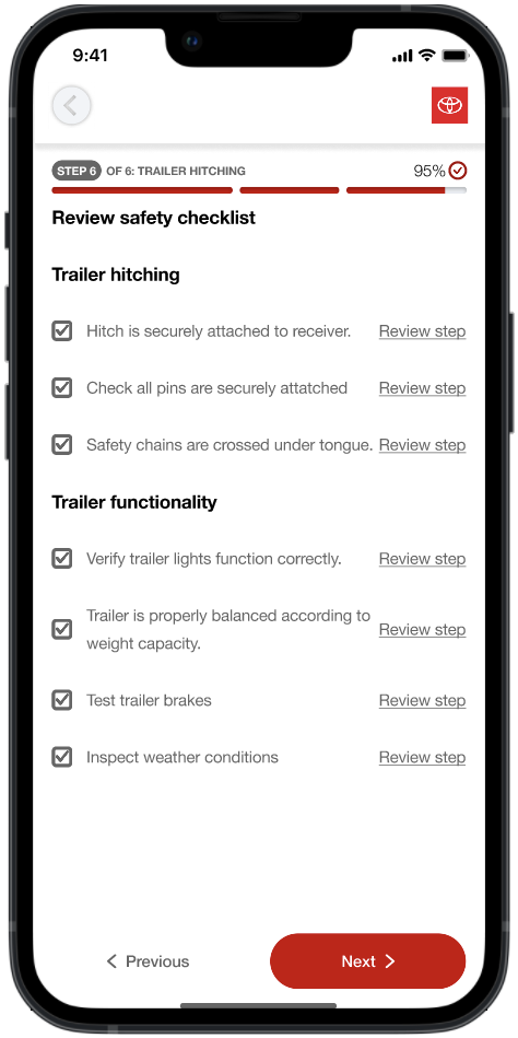
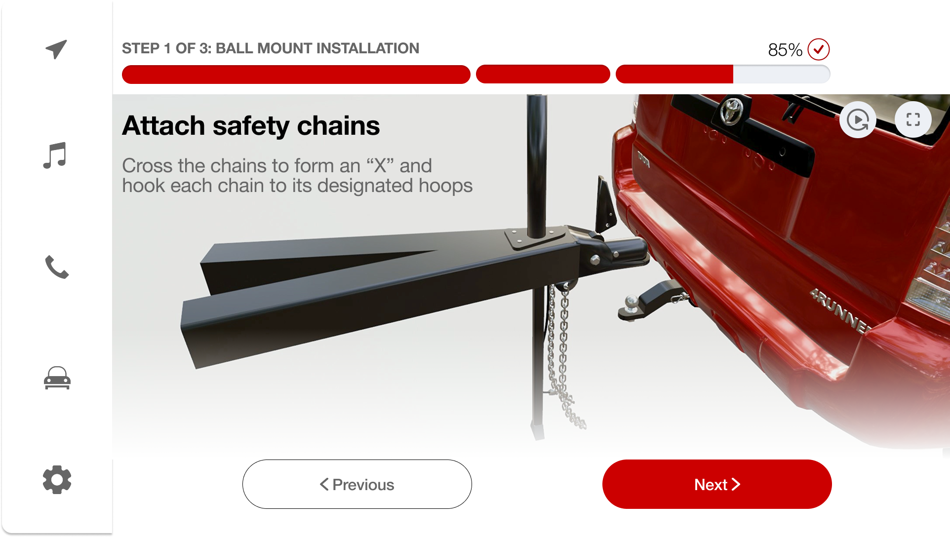
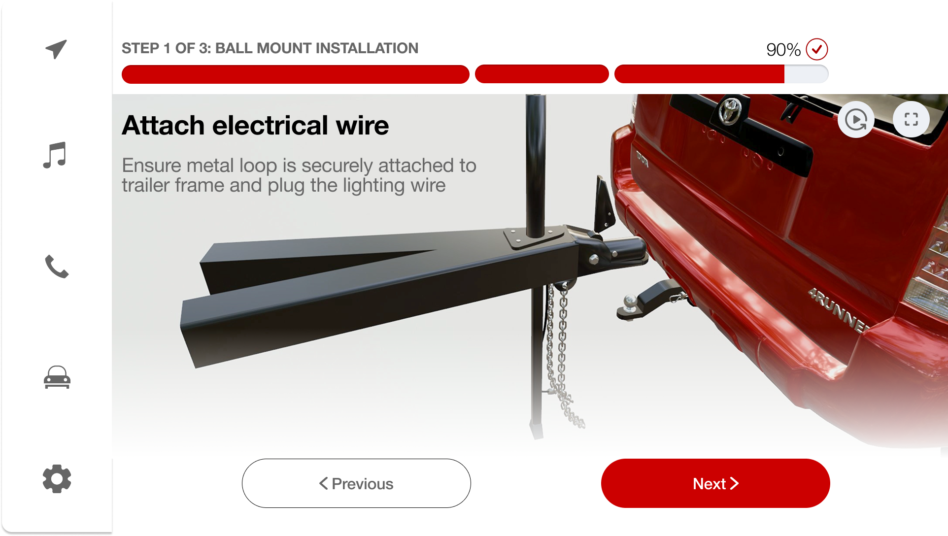
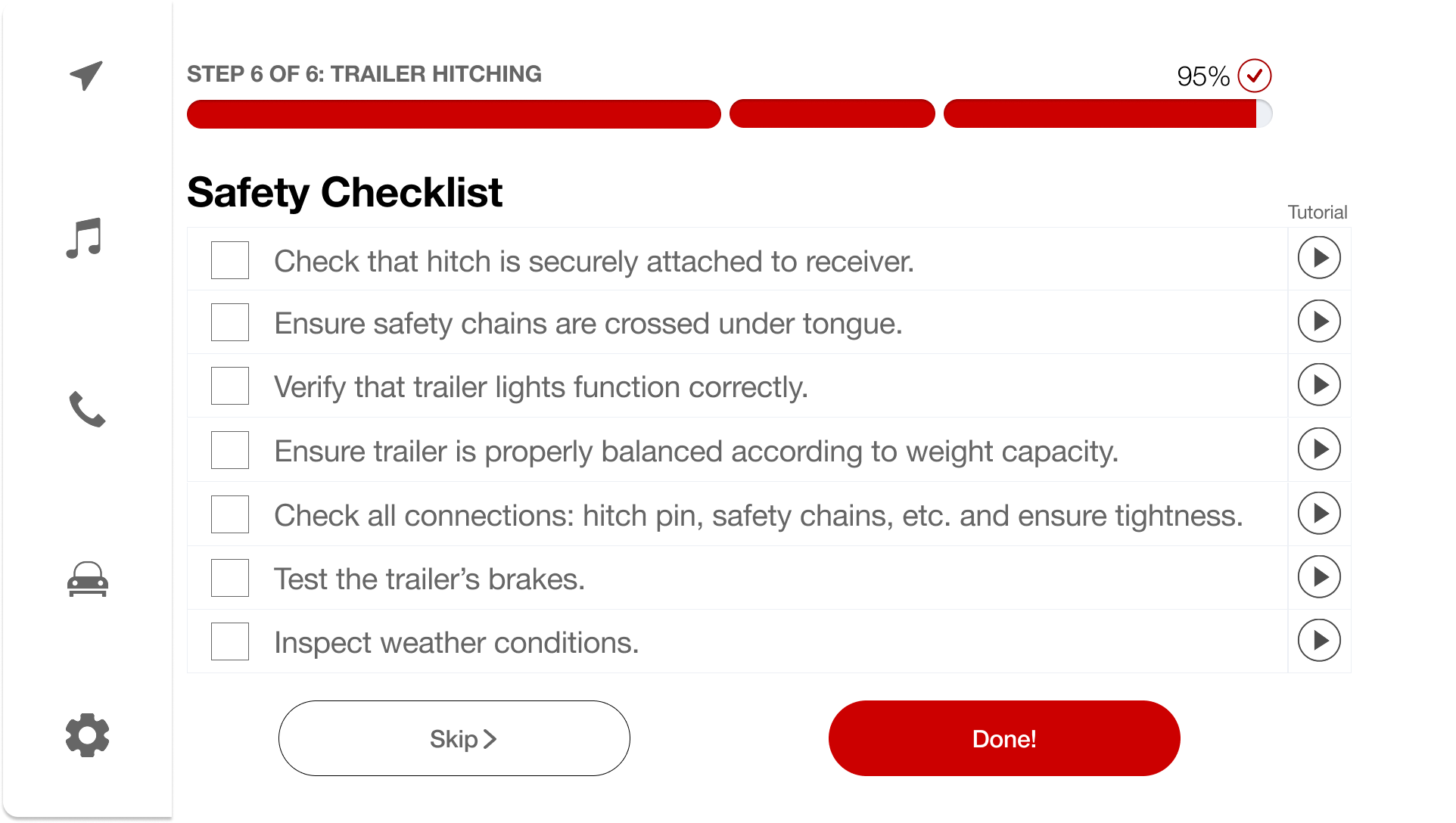
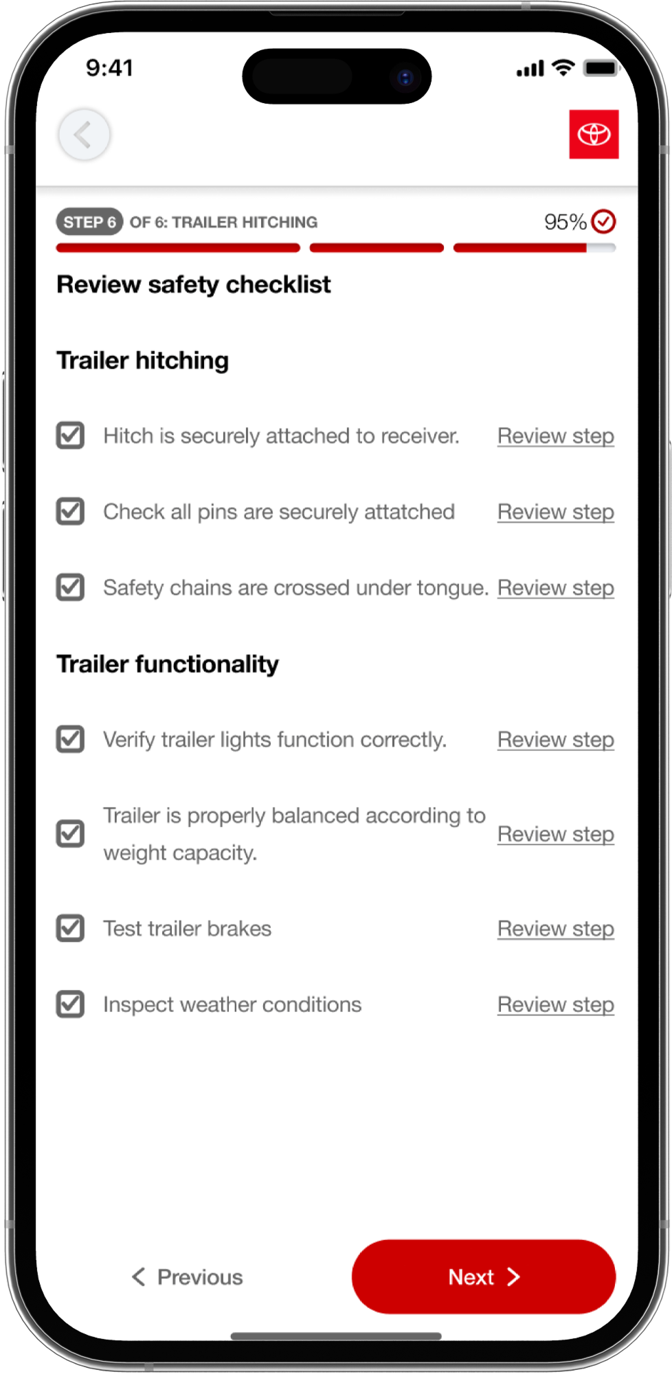
Remind Forgotten Steps
Smart alerts for commonly missed safety steps like pin locks and chain connections.
Ensure Snug Hardware Fit
Visual confirmation and sizing tools to verify components are properly secured.
Competitive Analysis
In consultation with Toyota stakeholders — engineering, design, and marketing teams — we gathered 6 key features from our competitive research and analysis:
Ease of Installation
How easily can users install the system? (Ex. instruction manual, guidance system, user-friendly interface)
Weight Capabilities
What is the maximum weight the vehicle can tow?
Safety Features
What features ensure user safety while hitching a trailer?
Camera Features
Are there particular camera features? (Ex. 360 view, multi-angle, etc.)
Model Compatibility
Is the system compatible with various vehicle models and/or accessories?
Unique Features
Any unique technological features that make the system stand out?
| Feature | Toyota (Ours) | U-Haul | Curt Mfg. | WeighSafe |
|---|
Click a row to see the takeaway
User Interviews
The competitive landscape highlighted opportunities, but I needed to validate these gaps with actual users. Through professional driver interviews, beginner driver sessions, and U-Haul field observations, I uncovered insights & pain points that shaped the direction of the solution.
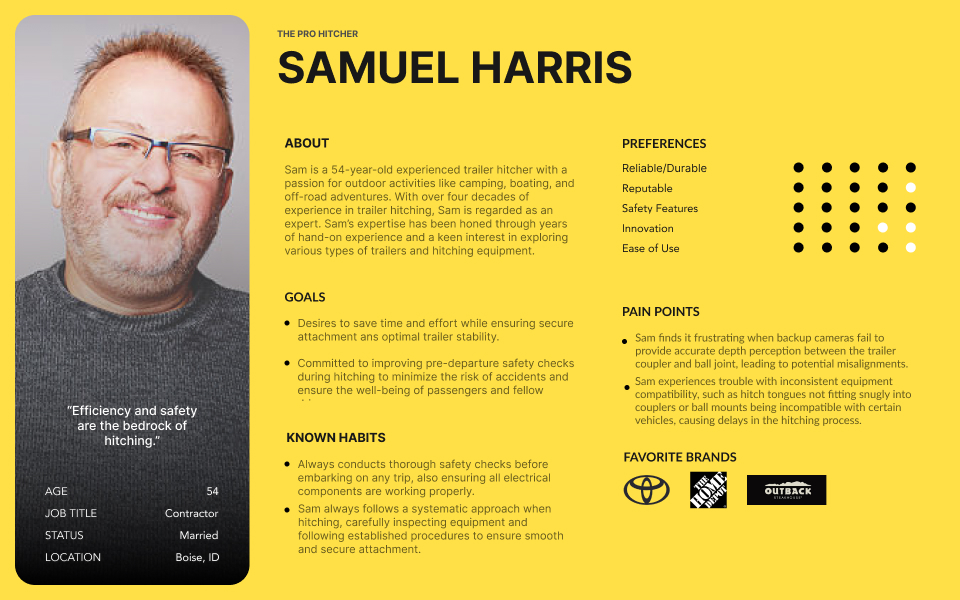
Pro Driver Interviews
I then synthesized interview notes into affinity diagrams & venn diagrams, where responses were grouped into categories & subcategories (e.g., safety, logistics, terminology). This helped the team identify key themes that directly shaped design decisions.

Key Insights
- Safety is non-negotiable: chains crossed, correct height, compliance checks completed.
- Common challenges: poor lighting, mismatched equipment, weight calculation.
- Pros emphasize efficiency but still highlight safety redundancies.
Impact on Design
Led to inclusion of safety checks and a pre-hitch questionnaire in the app flow.
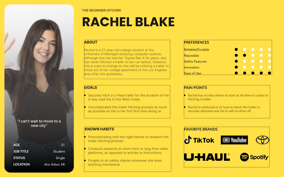
Beginner Driver Interviews
Key Insights
- High confusion around terminology and specific hardware parts.
- Steps perceived as most difficult: weight matching, chain setup, alignment.
- Users benefit from visual & text guidance, not text-only.
Impact on Design
Led to an informed tutorial video style (TikTok-like captions), progress indicators, and replay button for instructions.
.png)
U-Haul Observations
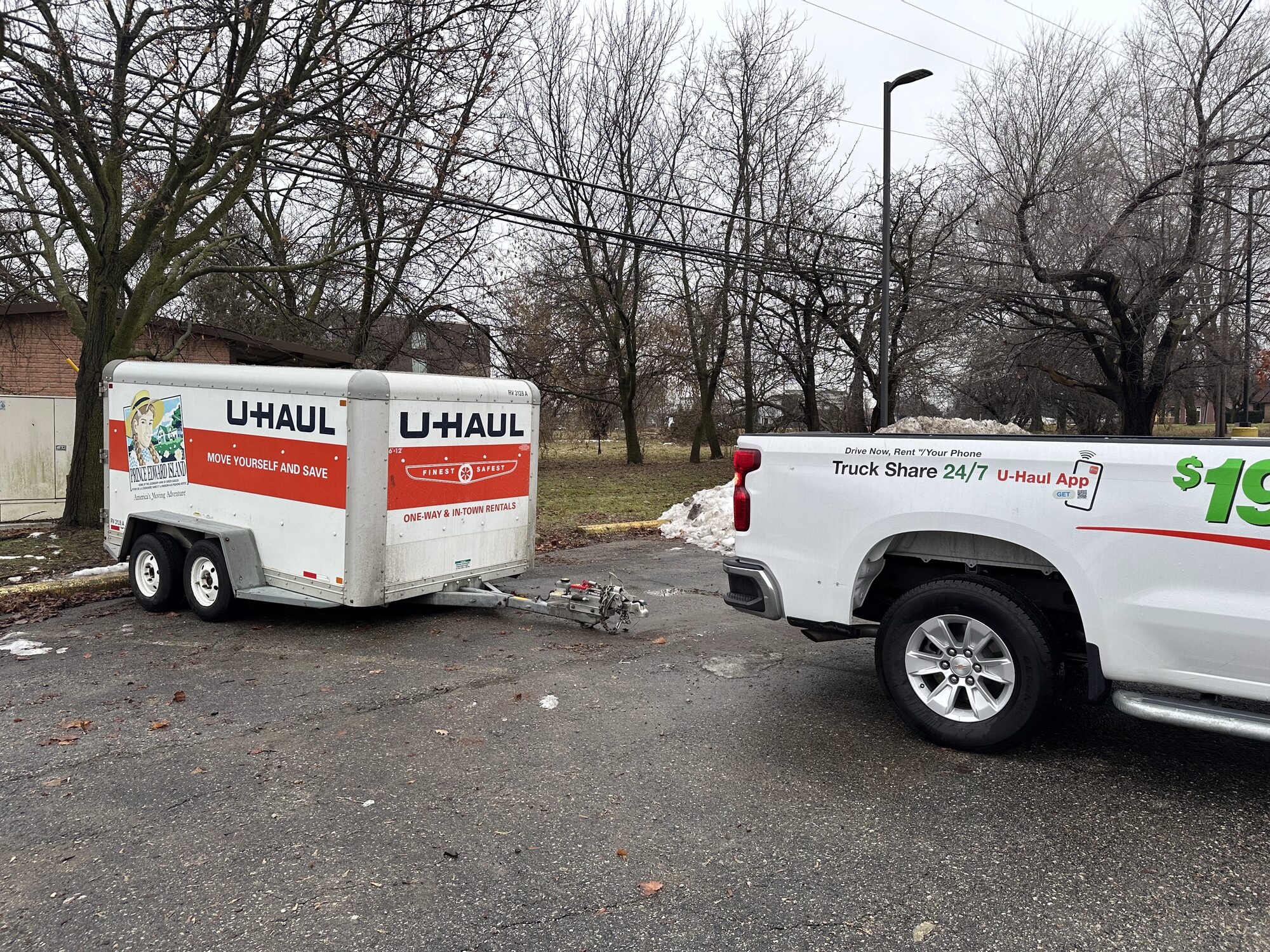
Key Insights
- Employees perform most tasks for customers, emphasizing safety compliance and equipment matching.
- Customers often confused by hardware differences and weight restrictions.
- Employees provide reassurance by explaining what could go wrong if safety steps are skipped.
Impact on Design
Reinforced need for unskippable safety check screens and clear terminology in the app.
User Personas
Each interview told a different story — but when we stepped back, we noticed recurring themes. To bring these user groups to life and keep their needs front and center, we developed personas for each interviewee type.
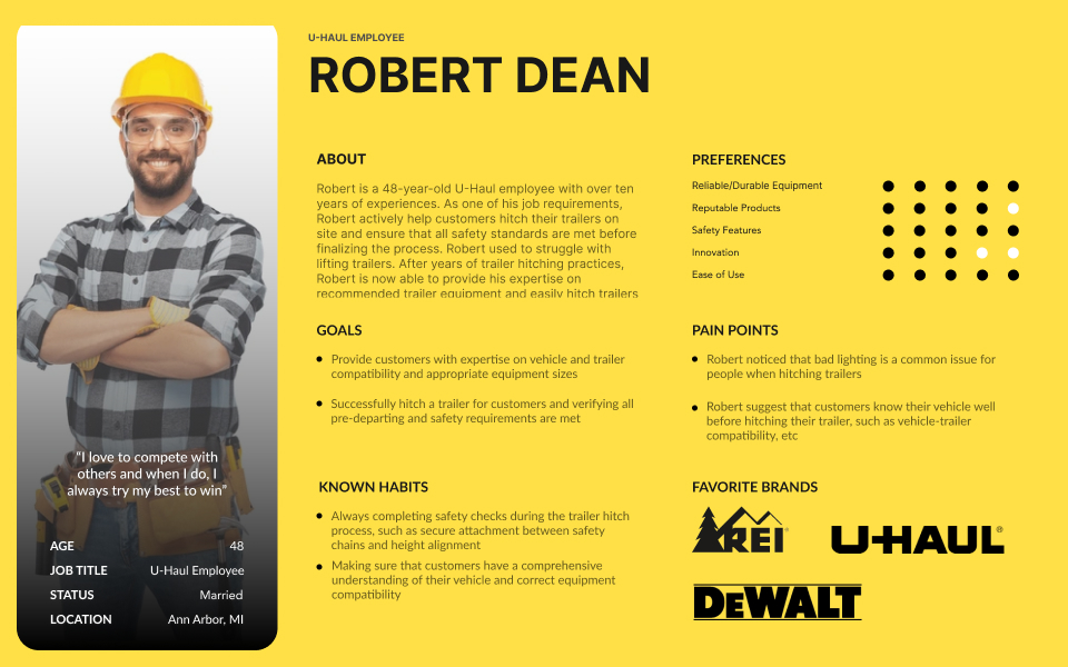
← Swipe to view personas →
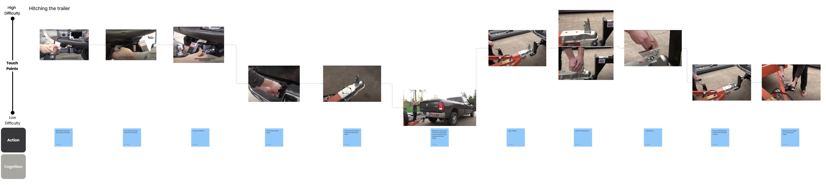
Journey Maps
Next, we visualized the user experience from start to finish, using the personas as a guide to create 3 journey maps: Booking a Trailer, Installing Hitch Package, & Hitching the Trailer. Crucially, users ranked the difficulty of each step — and those rankings directly shaped which parts of the hitching process we chose to focus on in the app. The hardest-rated steps became our design priorities.
Click to zoom in on the full journey map details.
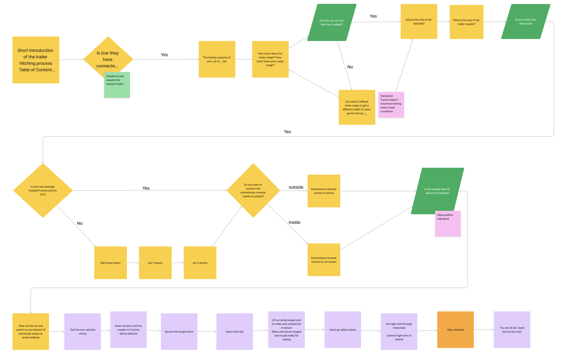
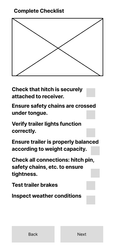
App Flow Diagram
With the user journey in mind, we mapped out the app flow to ensure each step of the experience is supported and seamless.
.png)